The idea of a full-blown brand redesign can sound like a daunting and time-consuming process, only to be met with fierce resistance from upper management. However, all brands need to adapt periodically to survive, and not all changes need to be a full-blown redesign in order to make a big splash.
Admittedly, it may not be considered a capital improvement and does require investment from marketing, but the way the market perceives your brand can be one of your biggest returns on investment.
Now we will examine how major brands have adapted their logos over time while still remaining recognizable and true to their heritage and brand promise.

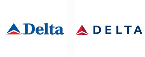
What Did Delta® Do?
- Changed their logotype to a more modern, sans-serif and digital-friendly typeface
- Deepened their color palette to richer hues of navy and red
- Modified their logomark to add a sense of depth with monochromatic tones of red

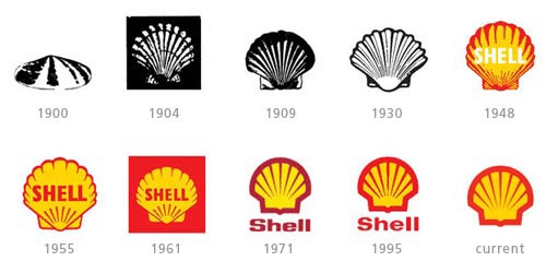
What Did Shell Do?
- Held true to their logomark of the shell shape, while still updating the look and feel. The latest renditions contain less detail and a flatter design.
- Variations with and without the logotype “Shell” – a trend we can see across other highly recognizable brands like popular social media platforms, for example. As we see communication evolving to include more emojis and symbols over type and text, this trend is here to stay.

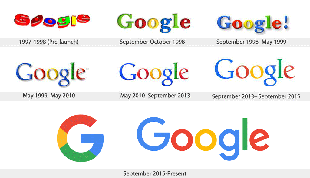
What Did Google Do?
- The Google logotype and color palette haven’t changed much since their conception, however, the styling has changed to a flatter design as well as a web-friendly sans-serif typeface (a standard for any tech company these days – check out branding done in the HBO show, Silicon Valley)
A piece of type or lettering in a logo or emblem
A mark or symbol that doesn’t contain the business name in a logo or emblem
Serif Typefaces are a font family that contains the small lines or shapes at the end of each letter stroke. (i.e. Times New Roman, Cambria)
San Serif Typefaces are a font family that does not contain the small lines or shapes at the end of each letter stroke (i.e Arial, Helvetica)
The spacing between individual letters or characters
The spacing between a group of letters or words
Using only one color, plus light tints or darker shades of that same color.
Clear trends begin to emerge when you examine these brand improvements and how they correlate with design trends and consumer expectations. You don’t have to be a major brand to successfully implement some of these simple techniques within your own logo. Subtle progressions can make a huge impact on how your brand is perceived while showing customers that your products are evolving for today’s technology, vehicles and trends.
Are you left with questions about whether a rebrand or small steps toward modernization are right for your company? Our team has extensive experience with rebranding projects and is here to help guide you through the process. We would love to discuss a strategy for brand improvements and how to convince upper-management this is the right move. Contact our team to get started.
LET'S DISCUSS YOUR PROJECT


